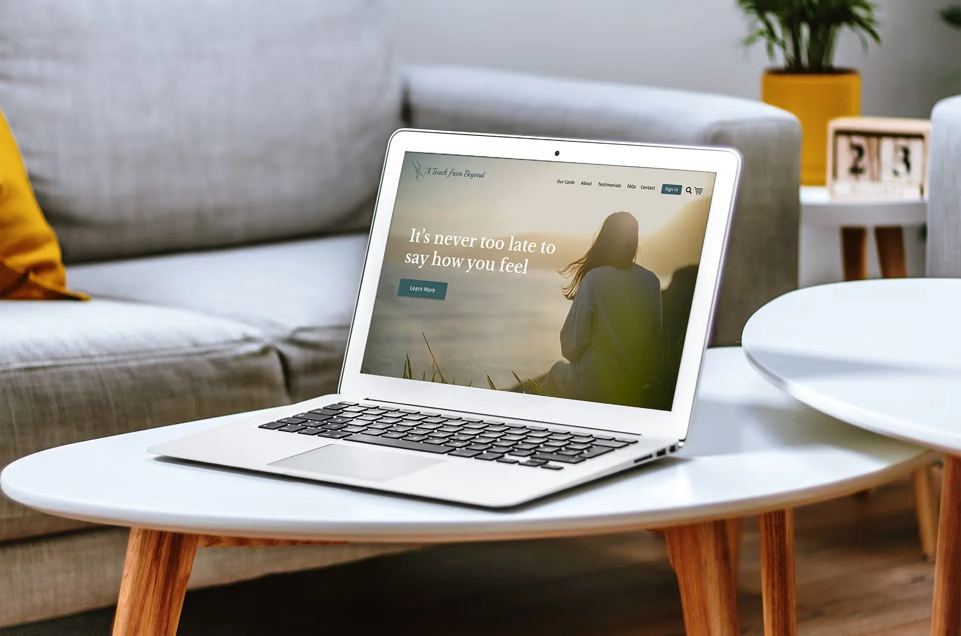
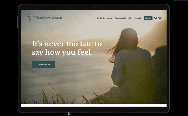
A Touch from Beyond
A Touch from Beyond provides cards for one nearing the end of their life– they can write messages and sign the cards for their loved ones. The cards are then given to the bereaved after their passing. My client had to step away from their business for several years to deal with their own personal loss, leaving the website outdated. The end outcome was to update the website and add e-commerce capability.
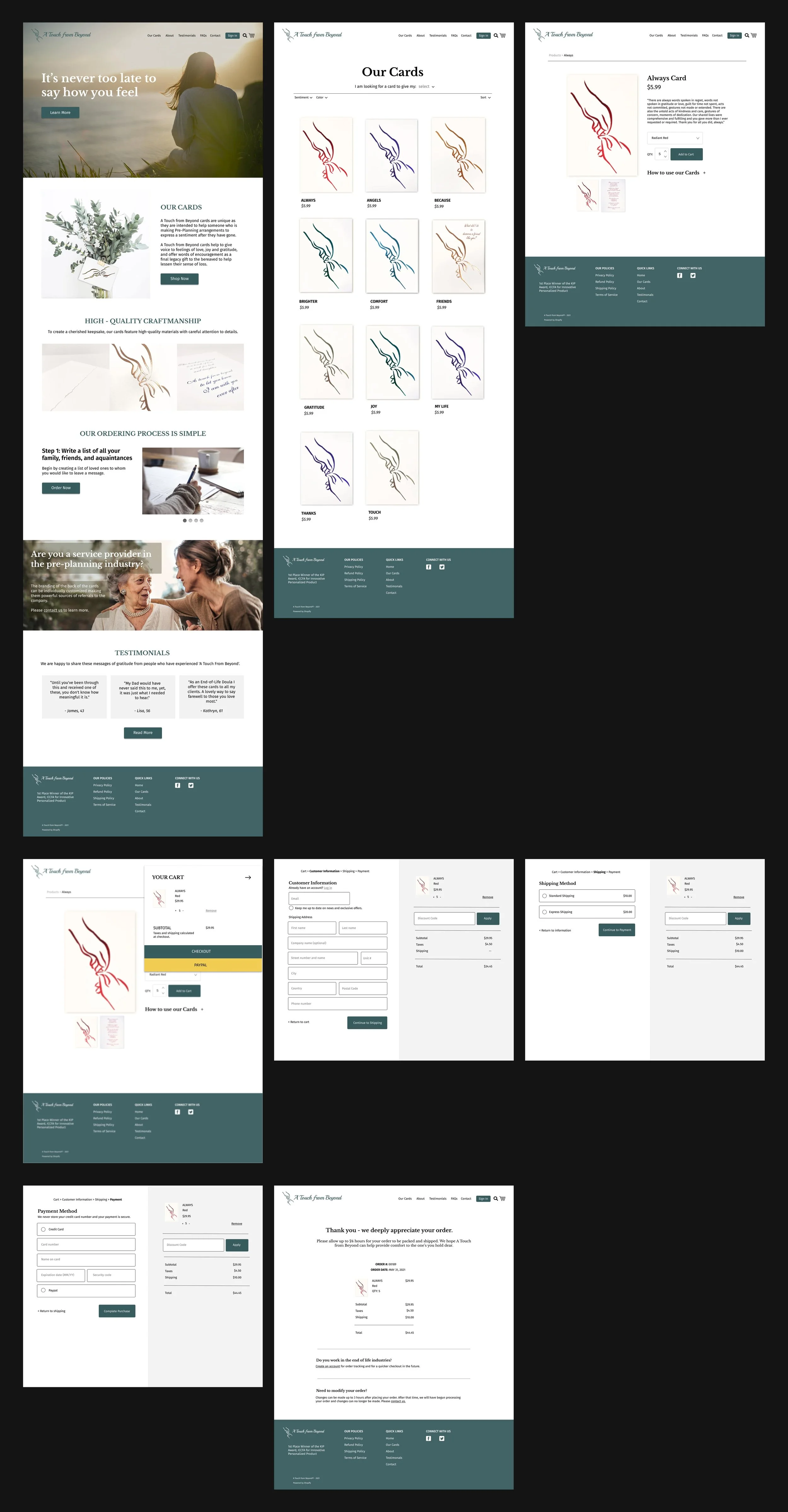
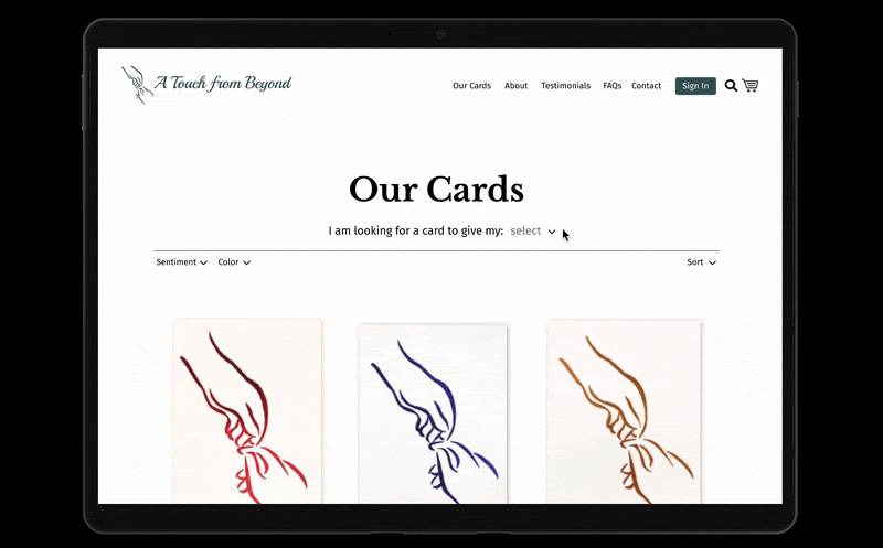
One of the main challenges faced was that all the cards looked very similar. They all had the same image on the front, with the colour and interior message differing. Our solve was to include a filter at the top of the products page that would allow the user to filter by whom they were addressing the card to.
A second challenge was the client did not see the need for a new logo. I was able to show through user feedback that the original logo was hard to read, and suggested a more legible typography. It was important to the client to keep the hands and cursive font so existing products would remain visually recognizable.
The UX Process
Below is my full UX research and design process.
Competitive Analysis
A Touch from Beyond cards are a unique and niche product, and I could not find any direct competitors. I decided to do an indirect competitive analysis to see how other similar companies structured their sites and marketed their service, and if there were gaps A Touch from Beyond could fill in the market.
User Interviews + Affinity Map
Next, I reached out to stakeholders. Two very distinct users emerged. The first being workers in the end of life industries, and the second being individual users purchasing cards for themselves. From the interviews, it became clear that the workers in the end of life industry were the main target users of the site, as they would be the ones making repeat orders, and bulk orders.
After the user interviews my team created an affinity map based on patterns and similar topics that emerged during our interviews.
Personas
Having spoken to individuals in the end of life industries, and individuals who were in pre-planning stages of their life, I now had a better sense of who our users were and who we were designing for. I created two personas– meet Denise and Sarah!
Journey Map
To further understand how the user would experience and move through the site, I created a journey map.
Site Map
Now that we had laid out all our ideas, and prioritized which solutions we could implement, I laid out a site map. We wanted to organize the site in the most intuitive way for the user.
User Flows
One of our major challenges was creating an e-commerce experience for A Touch from Beyond. To visualize the simplest and shortest steps for their users, I created a user flow of the purchasing step.
Low-Fidelity Wireframes
I was excited to begin this step of visualizing the site on paper. I mocked up some low fidelity sketches as a quick way to figure out how components of our site would fit together. I kept in mind the user’s interaction with the site, our team and client’s goals, and the information architecture during this step.
Mid-Fidelity Wireframes + User Testing
I wanted to test that my concept I had created for the site was functional and understandable to users so I created a quick prototype of the mid-fidelity wireframes. User testing was done with 8 users. The following problems areas were identified:
“I find the homepage too long. I had to keep scrolling and scrolling.”
“I couldn’t figure out how to change the quantity of the cards without going into my cart.”
“There are so many card options, I don’t know where to begin to look.”
These solutions were implemented in the final deliverable:
Condensed “steps” of how to use the cards to a sliding image feature.
Added plus and minus buttons next to the quantity on the product page.
Created a filter where cards can be sorted based on who the intended recipient.
User Testing (again) + Usability Survey
As my final step, I wanted to ensure the finished site was understandable for users. Using a high-fidelity prototype, 8 users were asked to complete tasks such as, adding an item to the cart, or adjusting an item’s quantity. Users completed a systems usability survey afterwards, and in comparison to the previous A Touch from Beyond site, users found the new site more functional and logical.